library(ggplot2)
library(plotly)
library(dplyr)
library(tidyr)
library(gapminder)
library(gganimate)
library(DT)

theme_brand <- function()
  theme_minimal(base_family="Arial") +
  theme(plot.title=element_text(face="bold",
                                color="#3f5988",
                                size=20),
        axis.title=element_text(color="#3f5988"),
        legend.position="bottom")

scale_color_brand <- scale_color_manual(
  values=c("#3f5988","#f56d40","#3c699b","#f6c5a0","#1b998b","#c44536"))

scale_fill_brand  <- scale_fill_manual(
values=c("#3f5988","#f56d40","#3c699b","#f6c5a0","#1b998b","#c44536"))Візуалізація даних у R за допомогою ggplot2
Тюторіал зі створення інтерактивних графіків (ggplot + plotly) — мінімум коду, максимум сенсу
Yurii K.
2025-10-20
Партнери
![]()

Проєкт “Data Analytics Bootcamp for Developers 2025” підтримує Європейський Союз за програмою House of Europe.
План
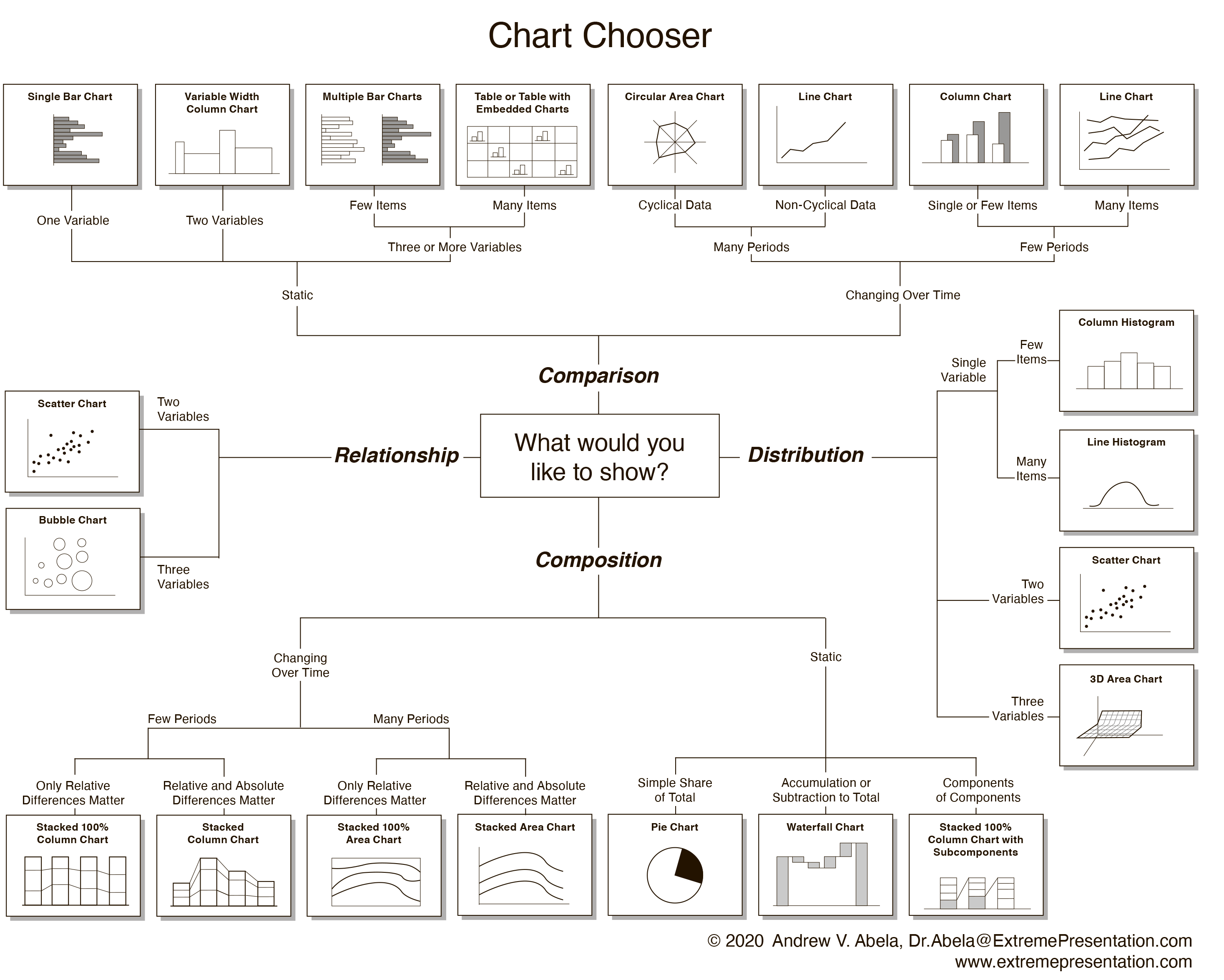
- Якими бувають графіки?
- ggplot2 у 10 хв: ідея та синтаксис
- Покроково ускладнюємо графік
- Базові типи графіків (scatter/line/bar/hist/density/box/violin/area/tile)
- Facets, scales, coord, themes
- Інтерактивність із plotly (hover/zoom/pan/legend)
- Анімації (plotly frames) + огляд gganimate
- Корисні джерела
Якими бувають графіки?
Налаштування
Набори даних (gapminder)
Набори даних (economics)
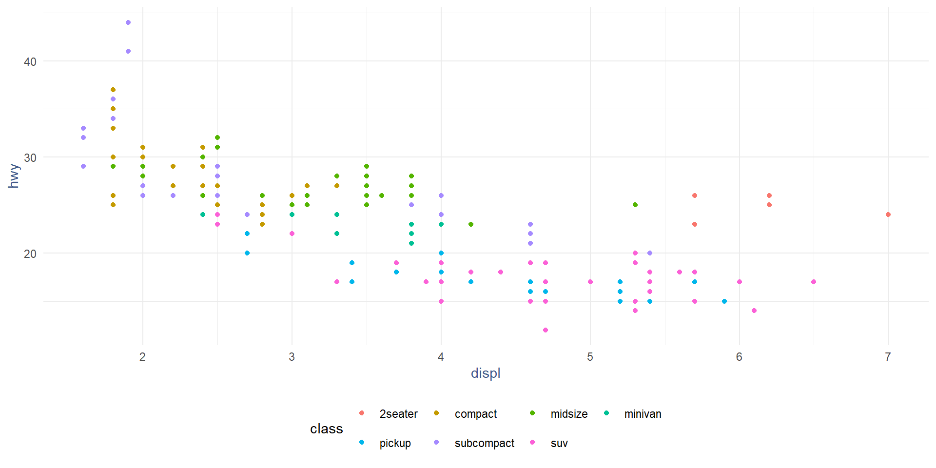
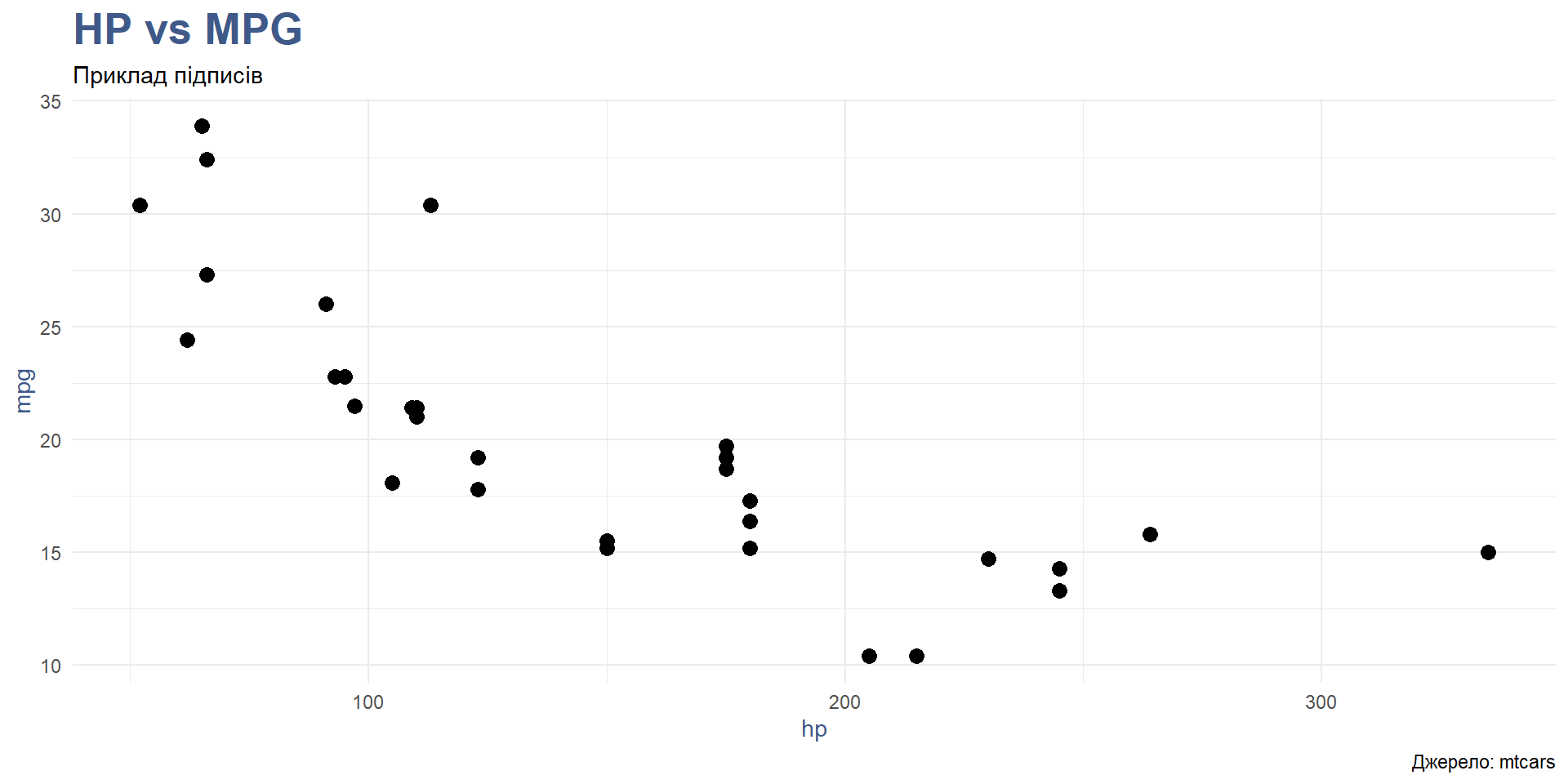
Набори даних (mtcars)
Синтаксис ggplot2
🔹 ggplot(data, aes(x, y, color, fill, size, group))
data— назва датафрейму, який використовується для побудови графіка.aes()— функція для задання естетичних параметрів (відображення змінних на візуальні елементи графіка):x— змінна по осі X.y— змінна по осі Y.
color— колір об’єктів (ліній, точок тощо) в залежності від змінної.fill— заповнення (наприклад, кольором) всередині об’єкта (бар, полігон).size— розмір об’єктів (наприклад, точок).group— групування даних для побудови зв’язаних ліній або інших графічних елементів.
🔹 geom_*()
Функція, яка визначає тип геометричного об’єкта для побудови графіка.
Приклади:
geom_point()— точкова діаграма (scatter plot).geom_line()— лінійний графік.geom_bar()— стовпчиковий графік.geom_histogram()— гістограма.
Кожен geom_ відображає дані в різний спосіб.
🔹 facet_*()
Функції для розбиття графіка на кілька панелей за значеннями змінних.
Дозволяє зручно порівнювати підмножини даних.
Приклади:
facet_wrap(~var)— створює окрему панель для кожного рівня змінноїvar.facet_grid(rows ~ cols)— створює панелі в сітці: рядки та стовпці за відповідними змінними.
🔹 scale_*()
Функції для налаштування шкал: кольорів, розмірів, осей тощо.
Дозволяє змінювати:
- підписи
- діапазони
- кольорові палітри
Приклади:
scale_x_continuous()— налаштування шкали осі X.scale_color_manual()— власні кольори дляcolor.scale_fill_brewer()— палітра кольорів з пакету RColorBrewer.
🔹 coord_*()
Функції, що визначають систему координат графіка.
Приклади:
coord_cartesian()— стандартна декартова система.coord_flip()— змінює місцями осі X і Y.coord_polar()— полярні координати (наприклад, для кругових діаграм).
🔹 theme_*()
Налаштування зовнішнього вигляду графіка.
Можна змінити:
- шрифти
- фони
- кольори сітки
- положення легенди
Приклади:
theme_minimal()— мінімалістичний стиль.theme_classic()— класичний стиль.theme()— детальне ручне налаштування елементів (наприклад,axis.text,legend.positionтощо).
Перший графік: scatter
Додаємо колір за групою
Розмір на основі даних про наслення
Вісь X (без кастомних labels)
Підписи даних
Facet-и
Лінійний тренд (smooth)
Лінійний графік (часовий ряд)
Стовпці: скільки країн на континеті?
Гістограма
Щільність розподілу
Boxplot
Violin
Area
Heatmap / Tile
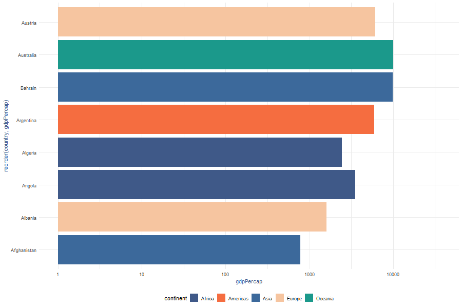
coord_flip (горизонтальні бари)
Частки категорій (донат)
Встановлення кольорів
Легенда: керування виглядом
Анотації
Титри/пояснення (labs)
Теми: детальна стилізація
Демонстрація тем
Інтерактивність: ховери (text)
Анімація
p_anim <- gapminder |>
  slice(1:(12*12)) |>
  ggplot(aes(
    x=reorder(country, gdpPercap),
    y=gdpPercap,
    fill=continent)) +
  geom_col() +
  coord_flip() +
  scale_y_log10() +
  scale_fill_brand +
  theme_brand() +
  transition_states(year,
                    wrap=FALSE,
                    transition_length=5,
                    state_length=1)

animate(p_anim,
        nframes=120,
        fps=20,
        width=900,
        height=600,
        renderer=gifski_renderer("gdp.gif"))
Анімація (приклад)
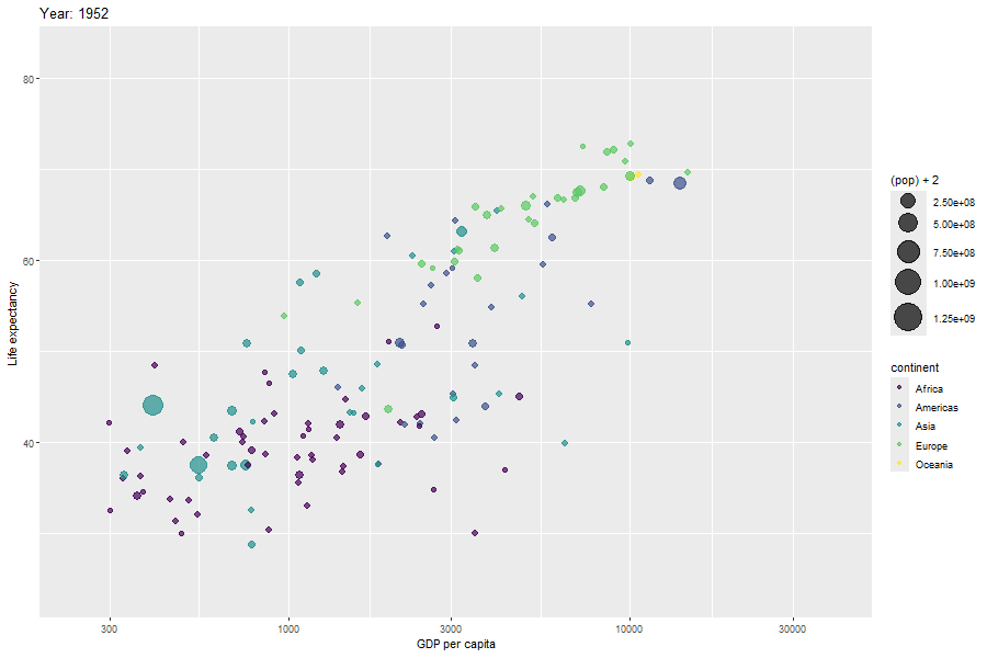
Анімація
p <- ggplot(gapminder,
  aes(gdpPercap,
      lifeExp,
      size = pop,
      color = continent)) +
  geom_point(alpha = 0.7) +
  scale_color_viridis_d() +
  scale_size(range = c(2, 12)) +
  scale_x_log10() +
  labs(
    title = "Year: {frame_time}",
    x = "GDP per capita",
    y = "Life expectancy"
  ) +
  transition_time(year) +
  ease_aes("linear")

animate(p, nframes=120, fps=20,
  width=900, height=600,
  renderer=gifski_renderer("img/animation2.gif"))
Анімація (приклад)
Додаткові матеріали
- https://posit.co/wp-content/uploads/2022/10/data-visualization-1.pdf
- https://r-charts.com/
- https://r-graph-gallery.com/
Джерела
- Hadley Wickham. ggplot2: Elegant Graphics for Data Analysis (Springer, 2nd ed.).
- Michael Friendly. R Graphics / ggplot2 (слайди).
- Christopher D. DeSante. A Short Guide to ggplot2.
- Catherine Barber. Visualizing Data with ggplot2 in R.
- RStudio Cheat Sheets: Data Visualization with ggplot2; Data Transformation with dplyr.
Дякую! 🙌
Питання? Пропозиції? Ідеї?
![]()